Mobile application
VolterGo
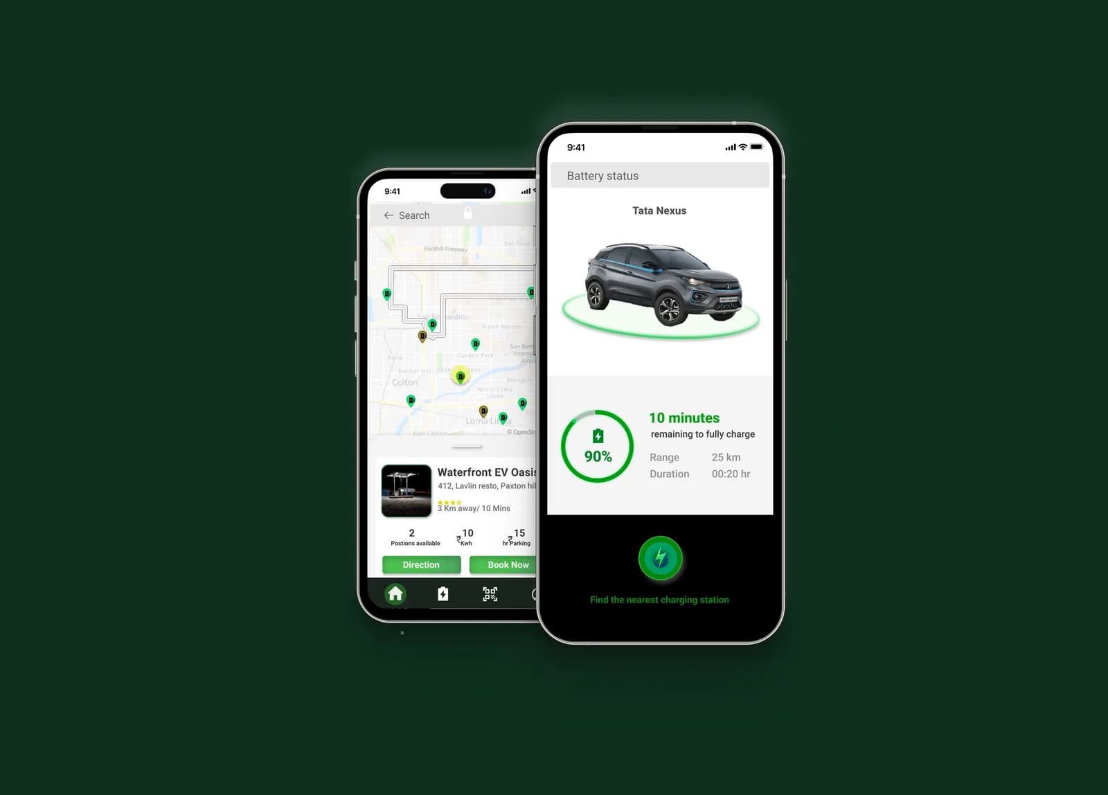
VolterGo enhances the charging experience for electric vehicle drivers by providing a seamless interaction between their mobile application and the charging station, increasing user satisfaction.
- Type
- Mobile application
- Role
- User research, interviews, empathy mapping, UI design
Goal
The project addresses a significant concern for electric vehicle users: the uncertainty around where the nearest charging station is, and whether they can reach it on their current battery.
Target audience
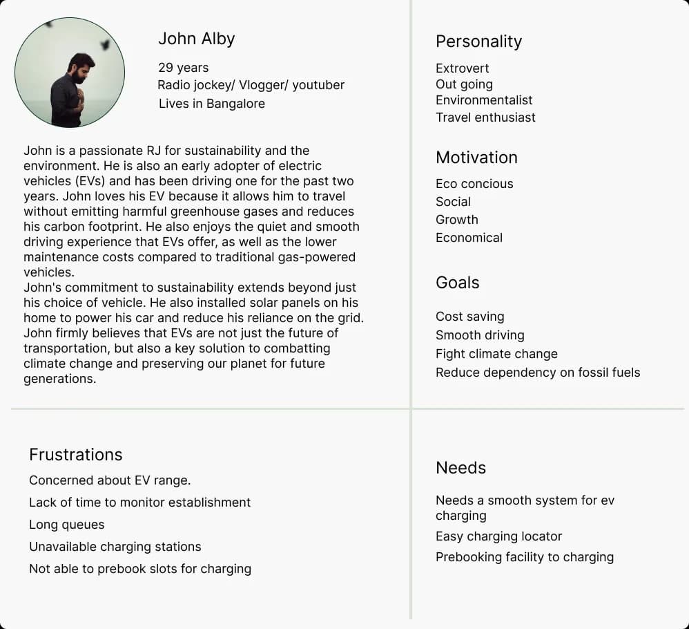
EV owners aged 25–50, the largest group at 57%. Owners who have bought an electric vehicle and are still working out how to use charging stations on the move, and who want a central platform for finding, scheduling and booking available chargers — with payment information, charges and process all in one place.
Purpose
An EV driver wondering where the closest charging station is, and whether they can reach it before losing power, needs to make a decision quickly — often while driving. VolterGo enables that, and lets users go further by reserving available chargers and getting access to facilities and services while they charge.
Problems observed
- Availability of a slot at the charging station — there simply aren't enough charging slots.
- Finding and locating nearby charging stations at all.
- Waiting in the queue for a turn to come around.
- Long charging duration, with no sense of status, estimated time or range.
Possible solutions
- A platform to book a slot in advance, and cancel easily.
- Availability of slots checkable before booking.
- Map integration showing nearby charging stations.
- Status of available charge, estimated time and range.
- A user flow simple enough to support quick decisions while driving.
The general task set: check available battery → find the nearest station → book a slot → pay.
Competitive analysis
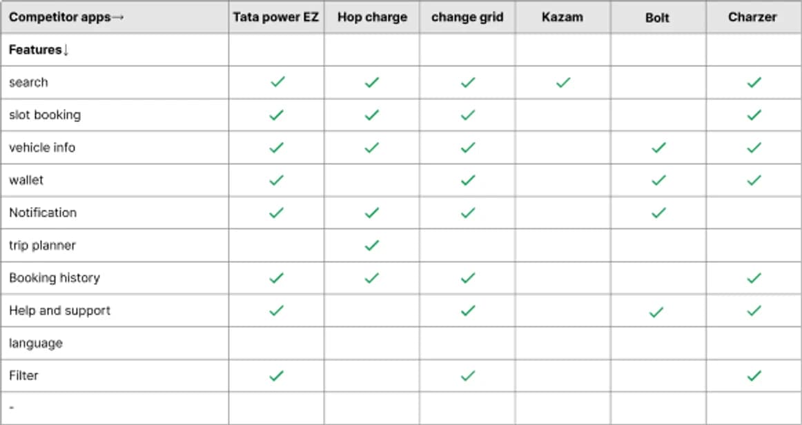
I ran a competitor analysis to see how well existing charging-station apps meet user needs. It identified gaps in the market and opportunities for improvement, as well as best practices worth borrowing.
Six apps were compared feature by feature — Tata Power EZ Charge, Hop Charge, ChargeGrid, Kazam, Bolt and Charzer:
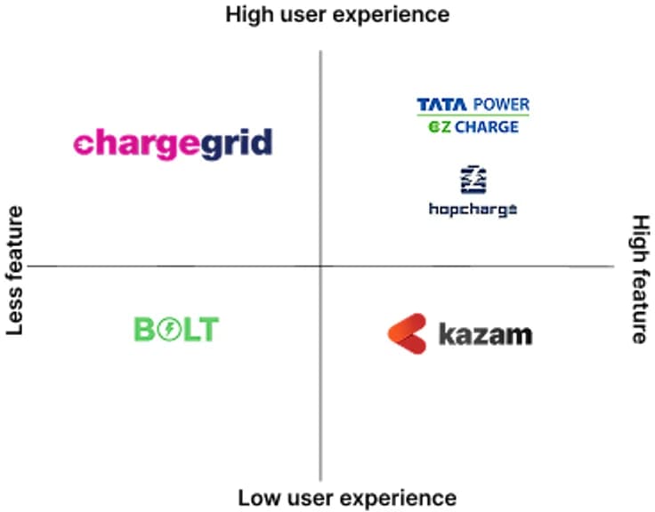
Plotting them against user experience and feature depth showed the gap the product could take: nothing sat in the high-experience, high-feature quadrant with any real breadth.
Qualitative interviews
I interviewed five EV owners with open-ended questions to get at their actual experience:
- What motivated you to buy an EV, and what influenced the decision?
- How often do you use it for daily transport, and what distance do you typically cover in a day?
- Have you used public EV charging stations before? What was that like?
- What is your charging routine at home, and how do you plan longer trips that need charging on the road?
- What are the most critical factors when choosing a charging station, and how do you weigh the options?
- Have you hit problems while charging, at home or at a public station? What happened, and how did you resolve it?
- How important is fast charging to you, and have you used it on longer trips?
- How do you pass the time while your EV charges, and what amenities or services would help at a station?
- What are the biggest barriers to EV adoption, and what could address them?
- Do you have any suggestions for improving EV charging infrastructure or services?
Insights
- Users struggled to locate EV charging stations while travelling somewhere unfamiliar.
- Most are working professionals who own two-wheelers and prefer charging at home, roughly twice a week, over charging at stations.
- Public stations mean long queues and high costs.
- Users don't plan trips around charging stations beforehand.
- Sudden battery discharge leaves users stranded with no idea where the next station is.
- Users spend roughly 20–35 minutes at a charging station.
- People are comfortable charging at restaurants, malls and other public places.
- Over longer distances, some experience real range anxiety.
- Users sometimes struggle to identify their charging connector type.
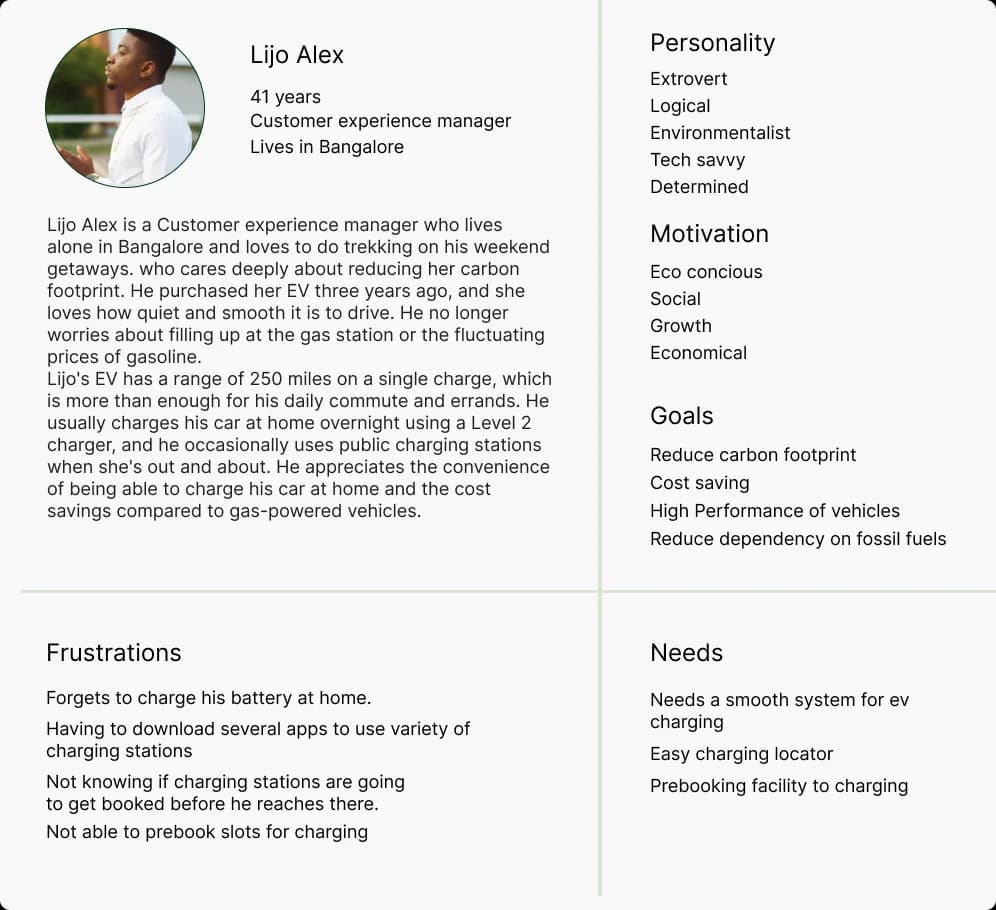
Empathy map
Lijo commutes daily for work meetings and recently bought an electric vehicle to cut fuel costs and reduce his carbon footprint. Driving to work, he notices his battery is low and starts looking for a charging station to be sure he can get home.
He thinks: Should I ask for help? When will I get home? How do I find a charging station? Which brand should I go to — is it reliable? Are there cafés, restrooms or other amenities nearby?
He does: asks friends and family for opinions, compares prices across brands, searches on Google, and compares the features of the existing apps.
He feels: excited, overwhelmed, afraid.

Stages of the journey
I mapped five stages, and for each one what the user is doing, how they feel at that touchpoint, and the opportunity it opens up.
1. Motivation. Planning a long trip. It's a happy time on the weekend — the opportunity is to show the user more stations, with more features.
2. Searching for a station. Entering a location and searching for nearby charging stations. The user doesn't know whether a slot is free; available slots should be shown.
3. Checking the time slot. Selecting the station, choosing a slot and booking it. Slow charging is annoying at this point; fast charging should be available.
4. Charging the vehicle. Waiting while it charges, with no discounts or offers to soften it — an opening for discounts and subscriptions.
5. Payment. Paying for the service, frustrated by how few payment options there are. The opportunity is simply to offer more of them.
Ideation
I opened the ideation stage with "how might we" questions, wireframes, a high-fidelity model and a user flow.
Problem statement
- Who is experiencing the problem — working professionals who own EVs.
- What the problem is — a low battery, and finding a charging station.
- Where it presents itself — while travelling.
- Why it matters — they want to reach their destination stress-free.
How might we
- Make charging stations promptly accessible to users when they need them?
- Make charging stations accessible to users setting out on a long trip?
- Teach users which sort of connector to use?
- Improve user engagement?
Solutions
- Users pre-book a slot at the charging station, which cuts waiting time on arrival.
- Users enter a from and to location, and the app shows the stations in between.
- Users pick a place, pick a station, and book the slot and the time.
- Users enter their model name and the app works out the connector type.
- Subscription plans offer discounts and rewards to subscribers.
Feature pool
Listing the charging stations, real-time updates on EV battery status, a trip planner with en-route charging, wifi at the mobile charging station, personal and vehicle data, emergency booking, amenities at the station, cancellation, time control, connector-type selection, language options, search by location, booking history, easy payment, multiple payment options, help and support, privacy and security, reviews and ratings, and referrals.
Prioritised features
Running that pool through a priority matrix produced the shipping set: listing charging stations, real-time EV battery status, a trip planner with en-route charging, wifi at the mobile charging station, personal and vehicle data, emergency booking, station amenities, cancellation, time control, connector-type selection, search by location, booking history, easy payment, help and support, privacy and security, and reviews and ratings. Language options, multiple payment options and referrals fell below the line.
User task flow
Keeping the personas in mind, the user flow lays out the steps and actions needed to carry out the intended task effectively.
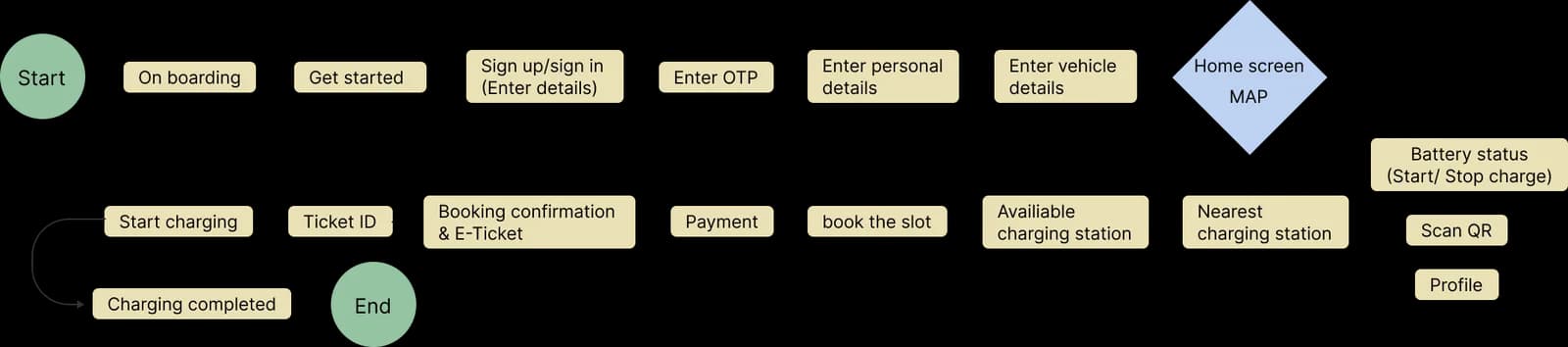
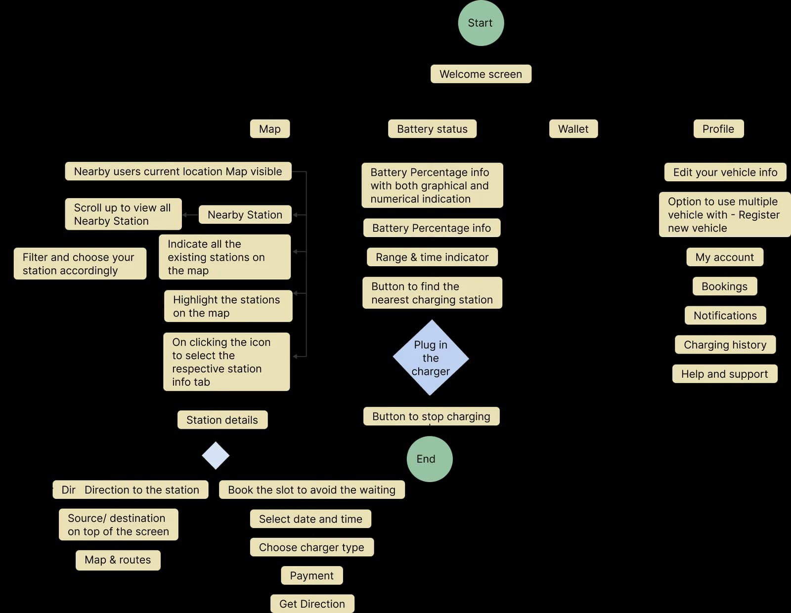
Information architecture
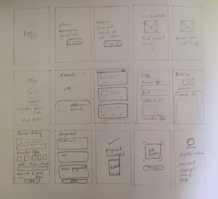
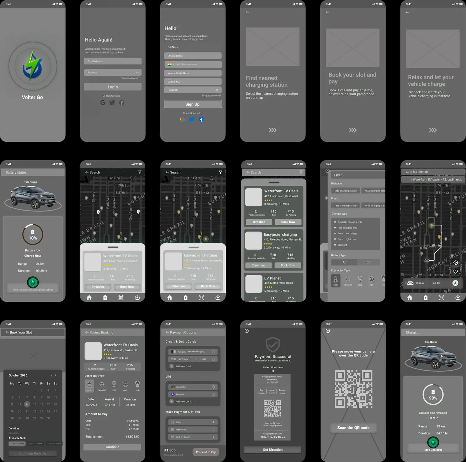
Low fidelity wireframes
Mid fidelity wireframes
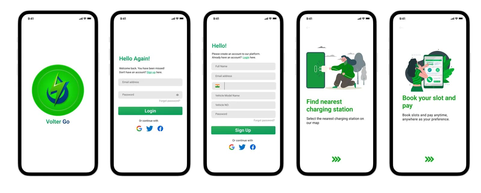
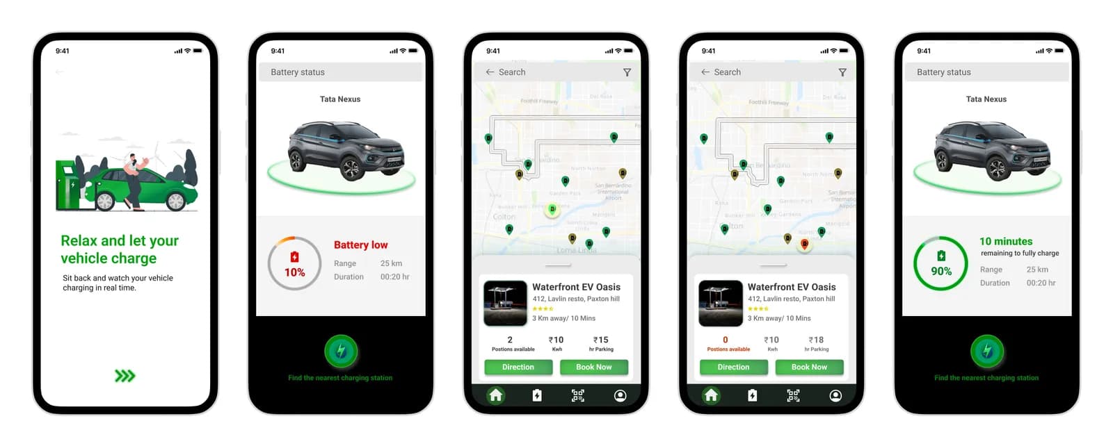
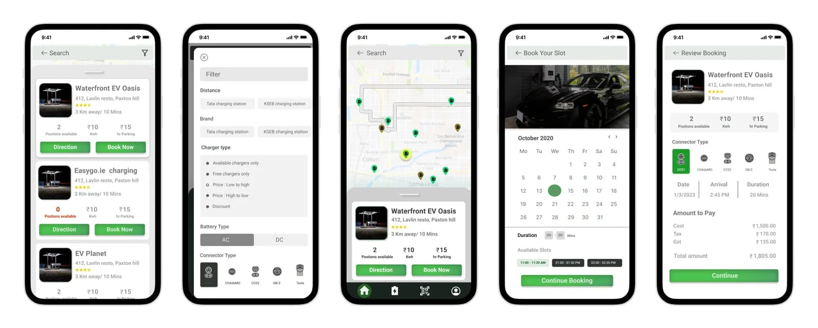
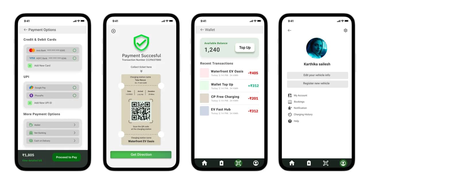
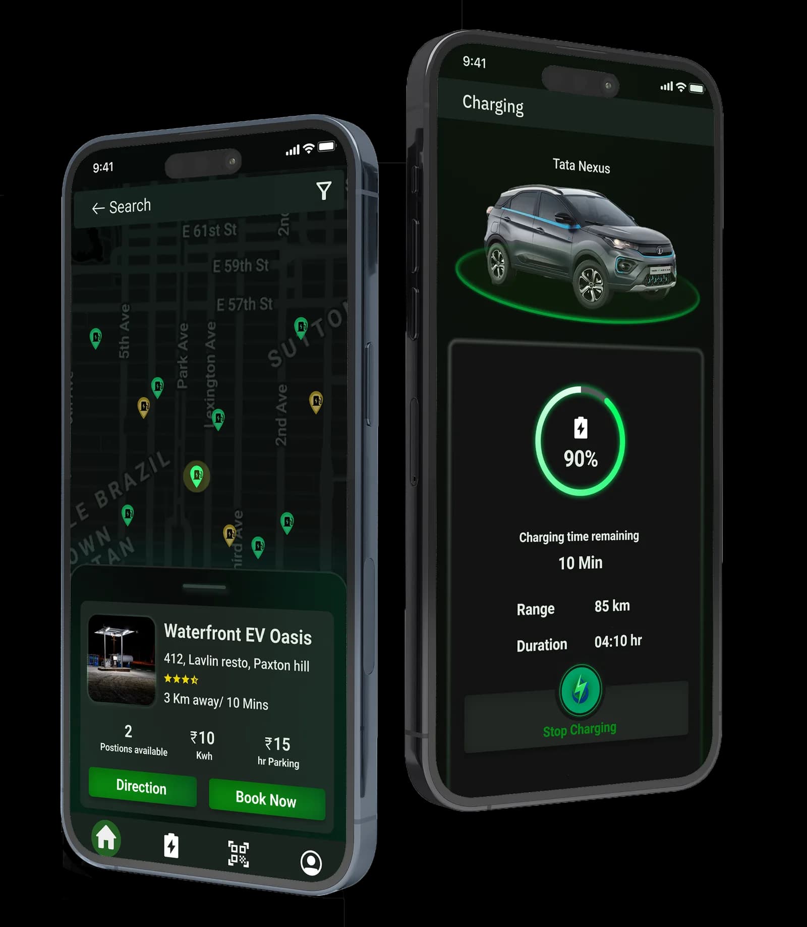
Final screens
Future plans
- A "plan your trip" feature that suggests charging stations en route and books them in advance, saving time on longer journeys.
- Continued work on the look and feel.
- A customer service bot in messaging, for users who need help.
Conclusion
Setting up charging stations every 5–10km, the way fuel stations are distributed in and around metropolitan cities, is impossible — there simply isn't the space. So beyond EV Port's own dedicated stations, the rest go into parking space that already exists: supermarkets, hospitals, malls, office spaces and restaurants, reached by leasing or renting the available listed parking.
Next project
FST Lab