Marketing website
FunctionUp
Branding, visual identity and website design for FunctionUp's School of Technology — a tech-enabled services company delivering workforce education.
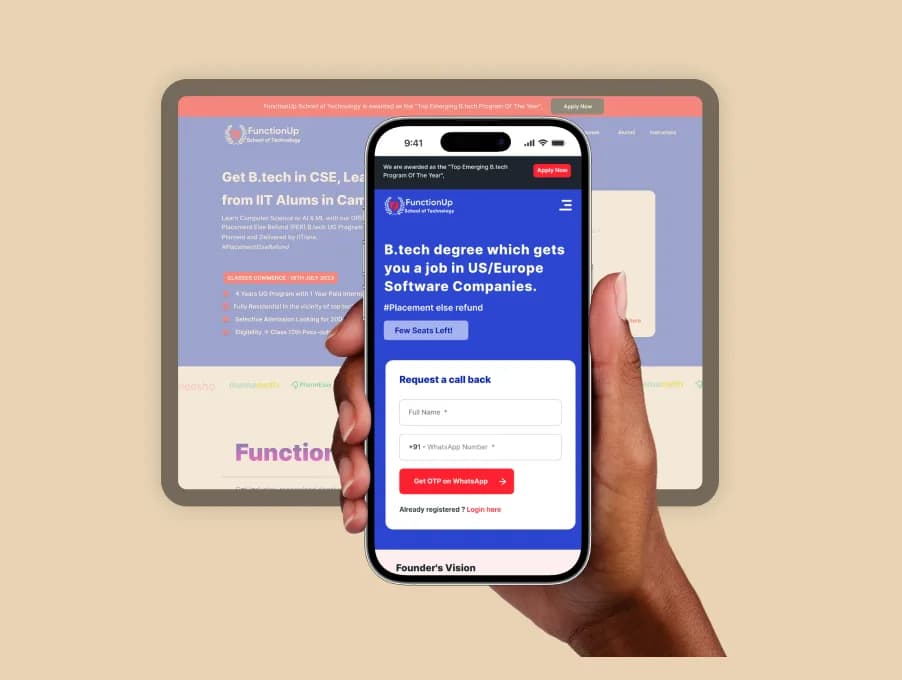
- Type
- Marketing website
- Role
- Branding, web design, illustration, user experience
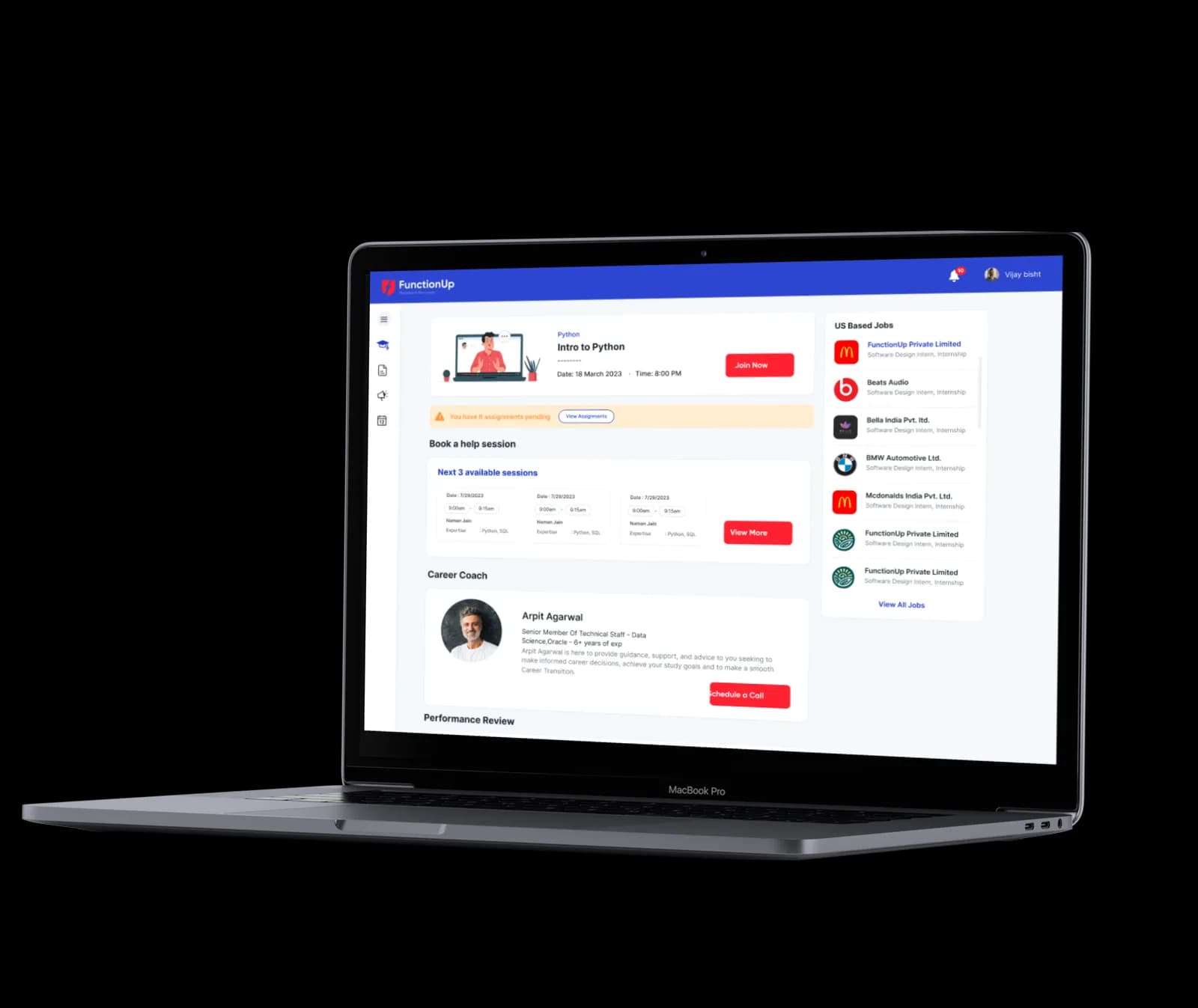
As UI/UX designer at FunctionUp I was responsible for the visual design and user experience of the product, working across websites, dashboards and web and mobile apps for the company.
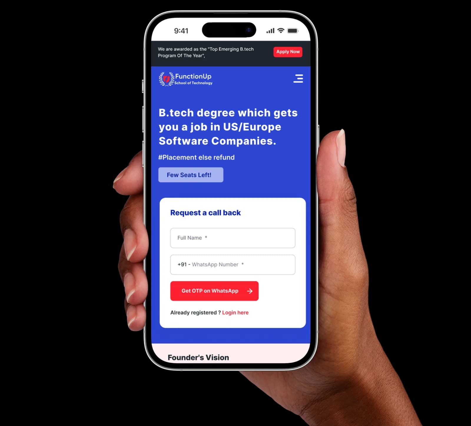
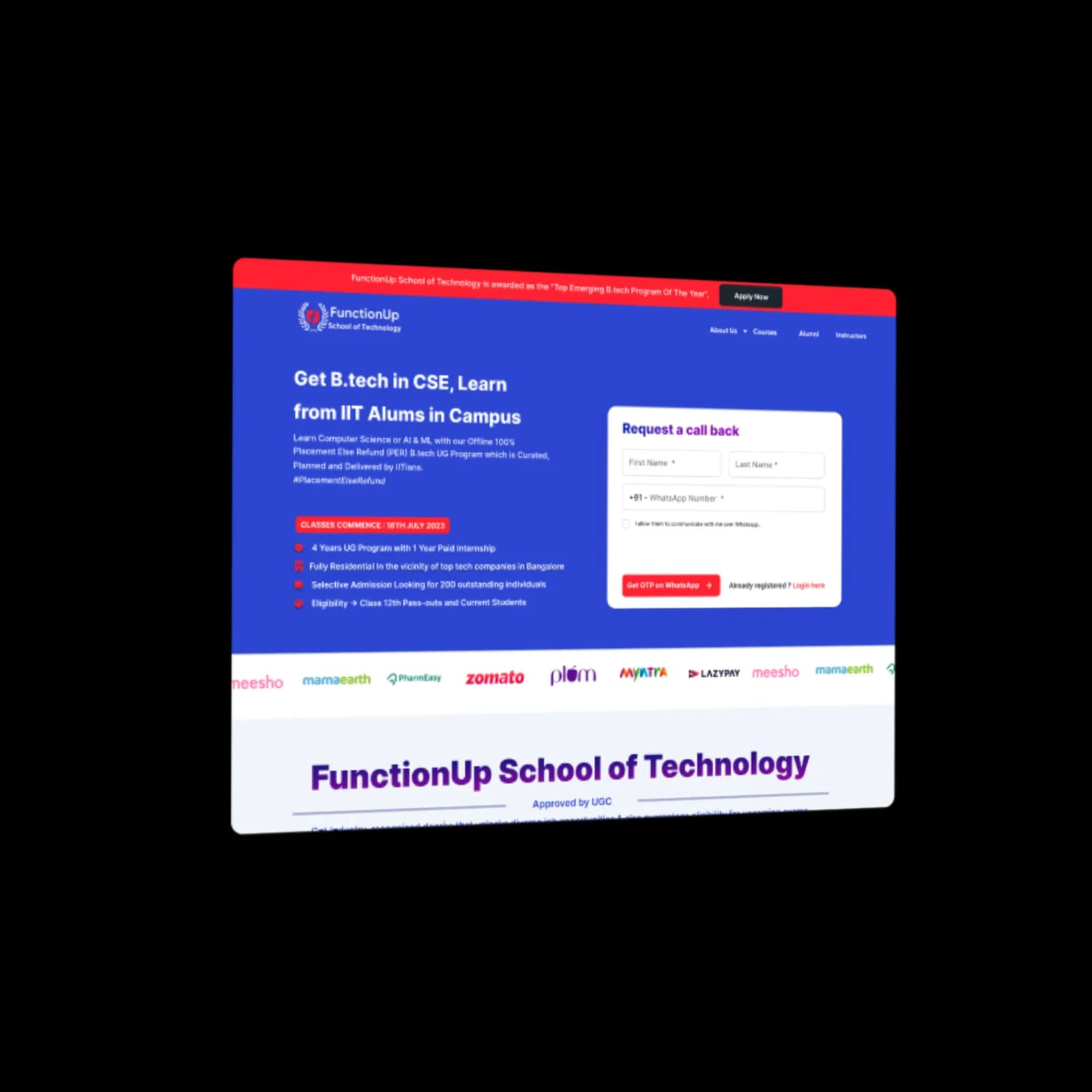
Final UI

FunctionUp
FunctionUp is a tech-enabled services company that delivers workforce education solutions.
Empowering the future through online learning: FST provides a comprehensive curriculum, expert instructors and flexible learning options.
My role
- User research, prototyping and UI design.
- Built and maintained a design system.
- Art direction and brand design.
FunctionUp School of Technology
I was tasked with the visual identity and user experience of the product: branding, web design, illustration, user experience and development.
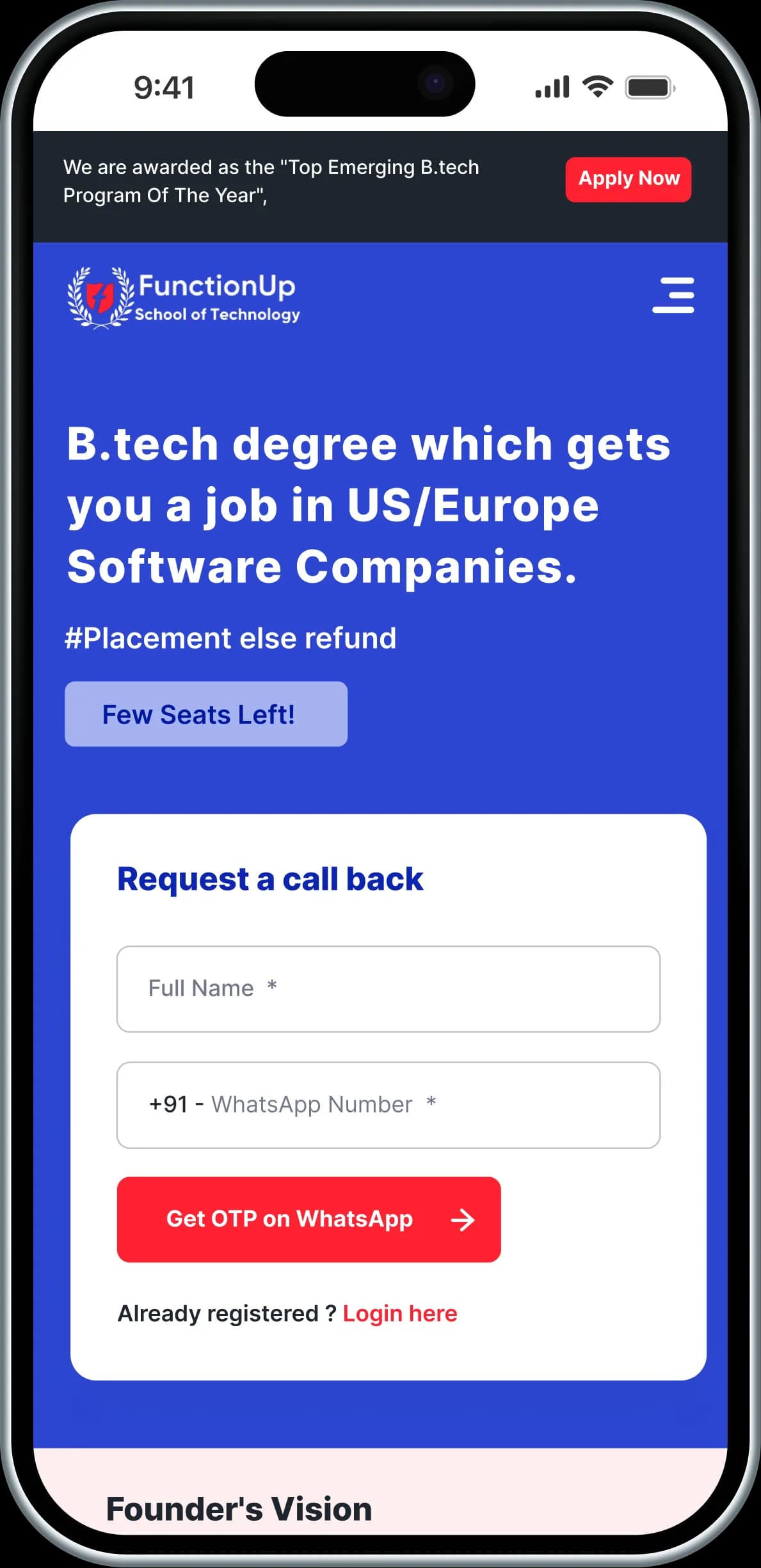
The solution
We started by developing complete branding for the platform with all its components — a logo, colours, a font pair and thematic illustrations usable across any medium. We then designed the websites, and the final stage was development.
Colour palette
The palette was chosen so all the colours work together and stand out against competitors. They reflect the mood of the company's work and convey it to users.
#FFFFFF · #E2F0FB · #0057E1 · #8E9097 · #414141 · #FCF2F2 · #FF2231
Typography
Helvetica paired with Inter — a simple, modern pairing that complements the branding and helps users take in information quickly. We also customised the spacing and line spacing for each element used on the site.
Scope of work
The project split into several stages, each demanding attention to detail and effort to reach high results and performance.
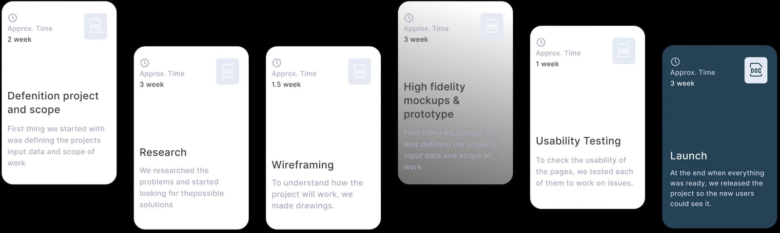
Why build the website? To introduce a new product — FunctionUp School of Technology — and let users explore the problem and sign up for the solution.
How have other firms designed theirs? After understanding the problem I looked at the ed-tech world, and what pleasures and pain points the giants have on their websites.
Who is it for? Freshers and sophomores from engineering backgrounds.
How does it benefit them? It helps users understand our solution to their problems around career and personal growth.
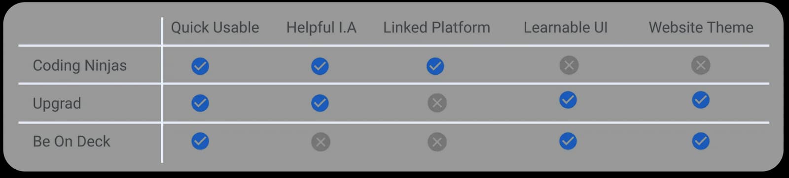
Looking at those other sites made one thing clear: a website with this much content is a genuinely challenging redesign, because content experience and user experience affect users simultaneously. So the focus had to be on effective information and relevant content that users can relate to and understand easily.
Landing page design
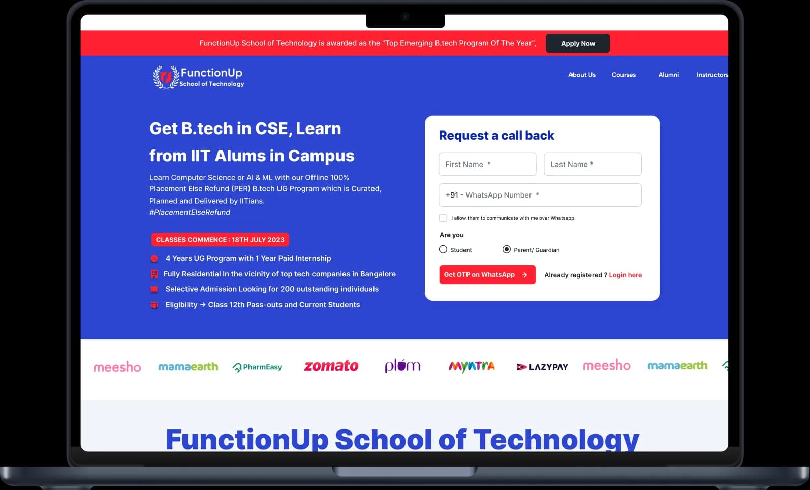
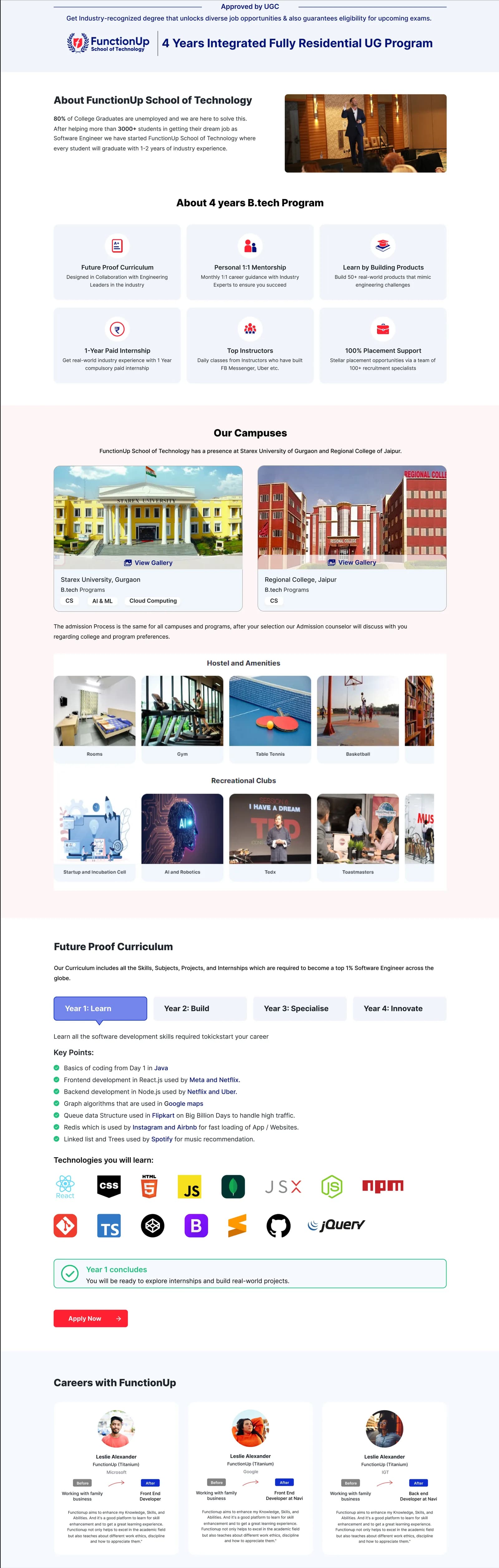
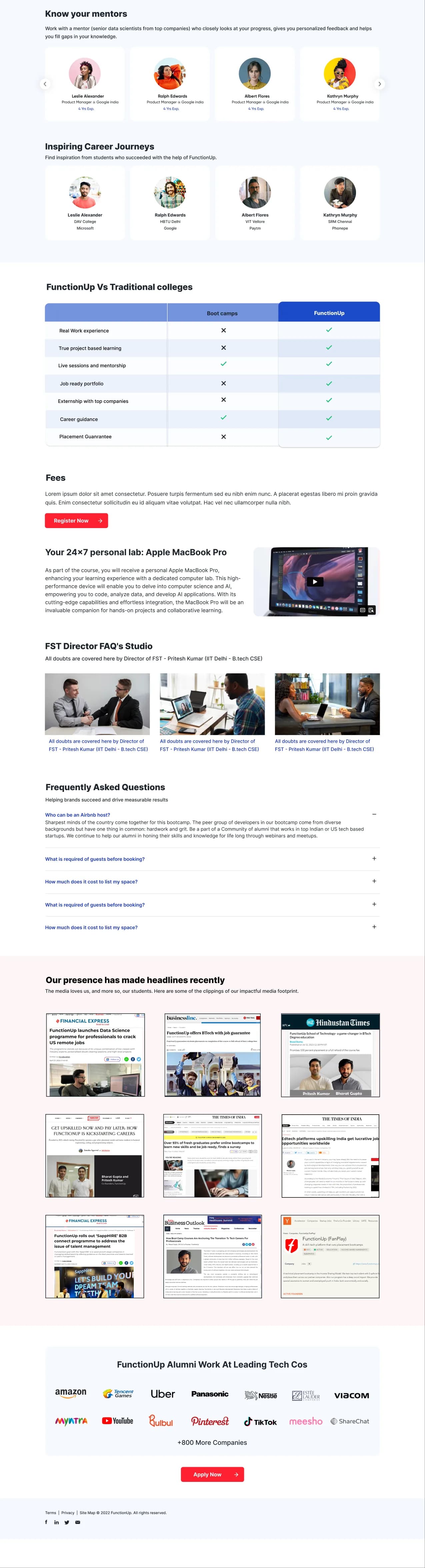
We developed the landing page from the graphic design work done for branding. It carries only the necessary information about the company, the services and the benefits to users.
Overall pain points solved
Improved information architecture. In plain terms, the old site made it hard to tell what was primary, secondary and tertiary. The new site follows a hierarchical organisational system, presenting content so users can read the level of importance of each element — using size, colour, contrast and alignment to let the brain distinguish objects by their physical differences. It is common enough, and has a great impact when done correctly.
A multi-page website, which is more organised and helps users navigate to the section they need.
Per-fold scrolling. Section-wise content in a single fold, so users don't have to scroll further for a particular section. Some sections wouldn't fit an integer fold, so those use fold continuation — there's no need to aggressively squeeze content above the fold.
A more learnable UI. The UI was a real weakness of the old site, so I built a specific theme for the programme — colours, backgrounds, gradients and elements. The idea was a trip-related theme, matching the programme's name: showing users the starting point, the path they'll cover, and their destination.
Next project
Dextra Recruitments